The Limitations of Color Swatches
If you google “seasonal color analysis,” you are likely to be met with images of colorful strips and stripes, all laid together in what promises to be a harmonious whole, but often feels chaotic and confusing.

Often I feel people have an excellent intuitive grasp of color—the emotion and resonance of it—but they are fed digital swatches which feel “same-y” and then they believe they have poor color perception. A collection of digital swatches often feels divorced from reality. Paper and fabric swatches are an entirely different world, but viewing blocks of static color through a computer screen is not very helpful. They rarely help people learn how to differentiate and categorize shades.
When I teach my clients about their seasons, I talk in terms of landscapes, universes, or film sets—the more imaginative and complex, the better. I don’t dwell in the land of digital swatches, which are so flat, uniform, and only exist to be perceived through a screen. Consider the True Winter collage below:

This True Winter landscape follows the principles of how I would dress a True Winter individual: it is composed of swaths of chilly neutrals, punctuated by pops of cool, electric color. What happens if I place a Soft Summer individual against this backdrop?
We see that our Soft Summer, with her subtly blended smoky tones does not easily find a home in this environment. Her soft, radiant features become almost mushy and indistinct. She feels more powerful and present in Soft Summer, where she naturally resides. The tones of her eyes, skin, lips, and hair are sensible and comfortable here. She doesn’t look too much of anything, because she simply exists in harmony.

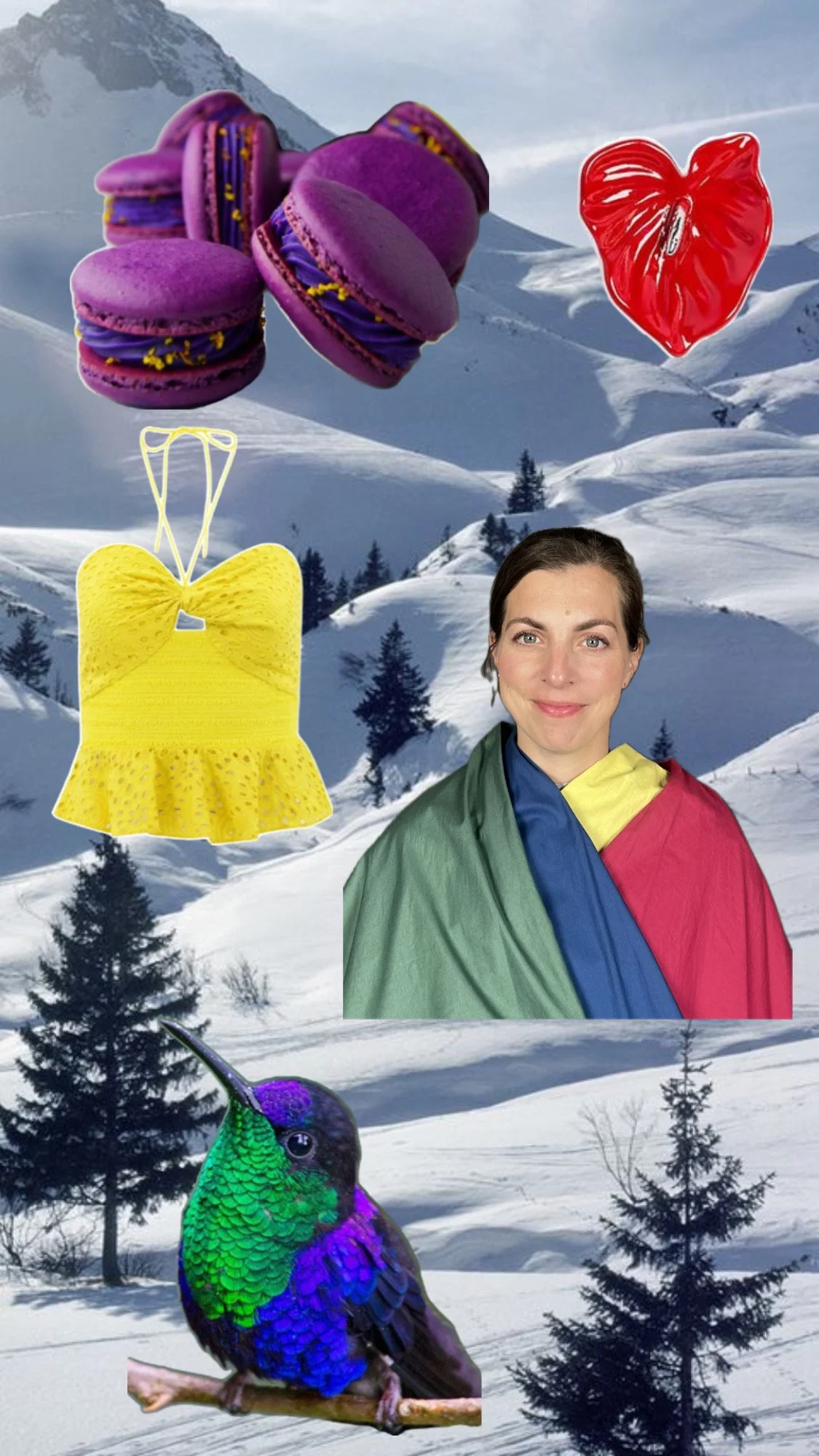
And on the flip side, does smoky, murky Soft Summer invite a True Winter person to settle in?

Or does our True Winter look strangely hard and almost cartoonishly defined? The delicate surface warmth of her skin becomes exaggerated by the extra warmth of Soft Summer, turning her yellowy-orange. To correct these issues, we only need to place her back where she belongs, among the crisp and cool tones of True Winter:

The manner in which our eyes perceive and digest color is fundamental to how we understand shapes and objects. Although neither of these images shows anything dramatically different (both are nature backgrounds with a mix of animals, food, and fashion) they have different effects on our mood and energy.
If you look to the True Winter image, your eye will make sudden, quick jumps between the colors. There is a fast, staccato pace to how your eye takes the colors in. The result is that the overall picture hums with electric energy. And so we get our stereotype about True Winter being an exciting, dramatic, formal season.
Now if you take your eyes over to the Soft Summer image, your gaze will naturally become a little sleepier. The muted, shadowy tones of this season appear to blur into one another at the edges. There is a luxurious, almost lazy feeling when your eyes slide from one element to the next. Soft Summer is renowned for a kind of easy, casual elegance that exudes effortlessness.
So each season has its natural strengths, based solely in its innate color qualities. These should not be taken as limitations—of course you can be effortless in True Winter or formal in Soft Summer—but these stereotypical strengths are rooted in something visceral.
Human beings are not color swatches. We are delicate blends of many tones. If you are struggling appreciate what each seasonal palette represents, I suggest you spend some time with my Pinterest Boards. There, you will find a huge array of natural and man-made items, which communicate more information than a little square of color on a computer screen.